Jefferies
JRequest is an internal tech-requesting platform within Jefferies. It had been around for many years and needed updates on the user experience, visual, and search capabilities. The design team within Capco and the technology team in Jefferies collaborated to help create a revamp of the platform. Our design team consisted of two designers and one researcher, and together we conducted thorough user interviews and a complete site redesign in less than three months.
Heuristic Evaluation
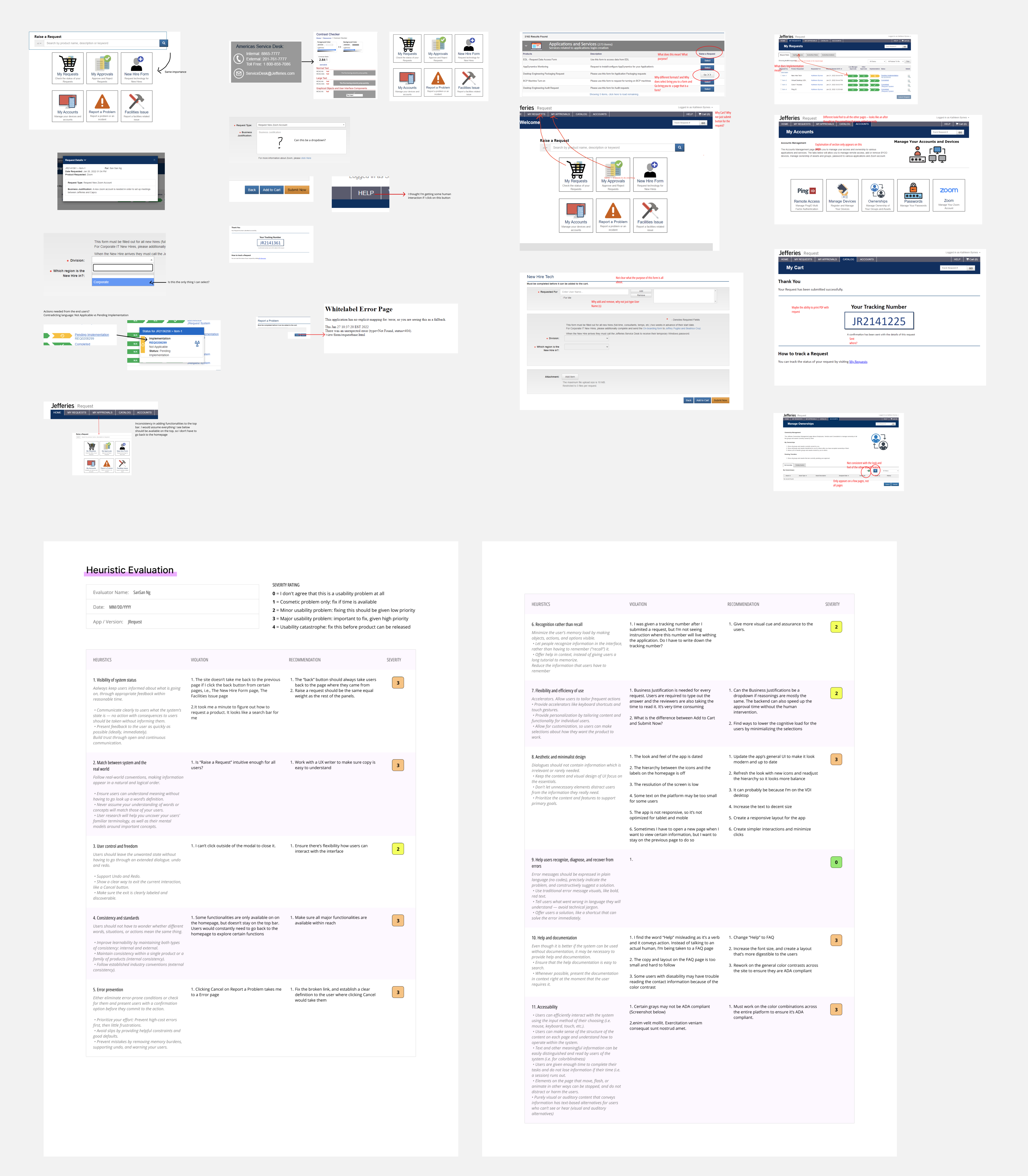
Our team conducted a heuristic evaluation to understand the underlying problems within the platform beside the issues Jefferies' tech team had told us.
One of the most critical issues we found was the search engine could be more intuitive; the users could only type in the specific keywords to search for what they needed. This limitation significantly reduced the self-sufficiency of the users to use the platform. Another issue we found was that the platform should use plain and simple language so everyone outside the tech team could easily understand and quickly perform their tasks. Besides search engine and language issues, the site was visually clunky and not user-friendly.

User Interviews
With the Jefferies team's help, we conducted user testing with 20 people that use the platform on a fairly regular basis. The interviewees were divided into two groups; the approvers and the requesters. The approvers are managers who need to approve the requests that are being raised. The requesters are employees who request access to certain websites or use certain apps.
Out of all the interviewees, most were approvers, and only 5-6 were requesters. We were concerned that we might not have enough data to show the problems users encountered when they wanted to raise a ticket. However, we started to see an emerging pattern after interviewing the fifth person. Through the heuristic evaluation and user interviews, the team consolidated the following list of opportunities for improvement.
Opportunity #1: Search Engine
The search engine was not intuitive; users could only use specific keywords to find the software or other needed requests. Often, the users would give up after a few tries or bypass the site entirely and call for help instead. Improving the search engine and making it as sensitive and efficient as the Google search engine would significantly enhance the self-sufficiency of the site, which was the purpose it was first created.
After presenting the data to the Jefferies tech team, they agreed to implement a better search engine while the design team updated the rest of the platform.
Opportunity #2: Language
The original site was created by tech-savvy people, and therefore the language used was also technical, and acronyms were frequently used. A few interviewees said they had no idea what those acronyms meant, even though they worked in Jefferies for many years. We suggested using plain and simple English so that nontech-savvy people can access the site without confusion.
Opportunity #3: Approval Process
Many interviewees complained the approval process was flawed. The process was not transparent, and the users did not know who to contact when the ticket was being held up. A ticket usually needed to be approved by multiple people, and the requester often emailed the wrong approver, which delayed the approval process. We would use the design opportunity to improve the approval process and ensure the process is transparent and easy to keep track of.
Opportunity #4: Notification Email Layout
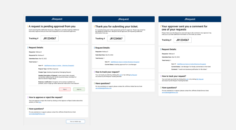
The notification emails sent for approval were dated looking, with little hierarchy established. Users complained that the email layout made it hard to pick up the crucial contents when they skimmed through it on their phones. I took that opportunity to redesign the email template to ensure that the users could quickly pick up the vital information.
Opportunity #5: Look and Feel
The look and feel site hadn't been updated since its creation, and many mentioned that it looked like a website from the 90s. We would use the opportunity to update the design and ensure it reflects the current brand value.
Opportunity #6: Accessibility
Much of the text on the colored background didn't meet the ADA Compliance for contrast, making it harder for people with visual impairment to read the contents. Although we did not have the resources or time to design the platform to be completely accessible to everyone, I wanted to ensure that the color contrast meets the WCAG requirement.
Design
Homepage:
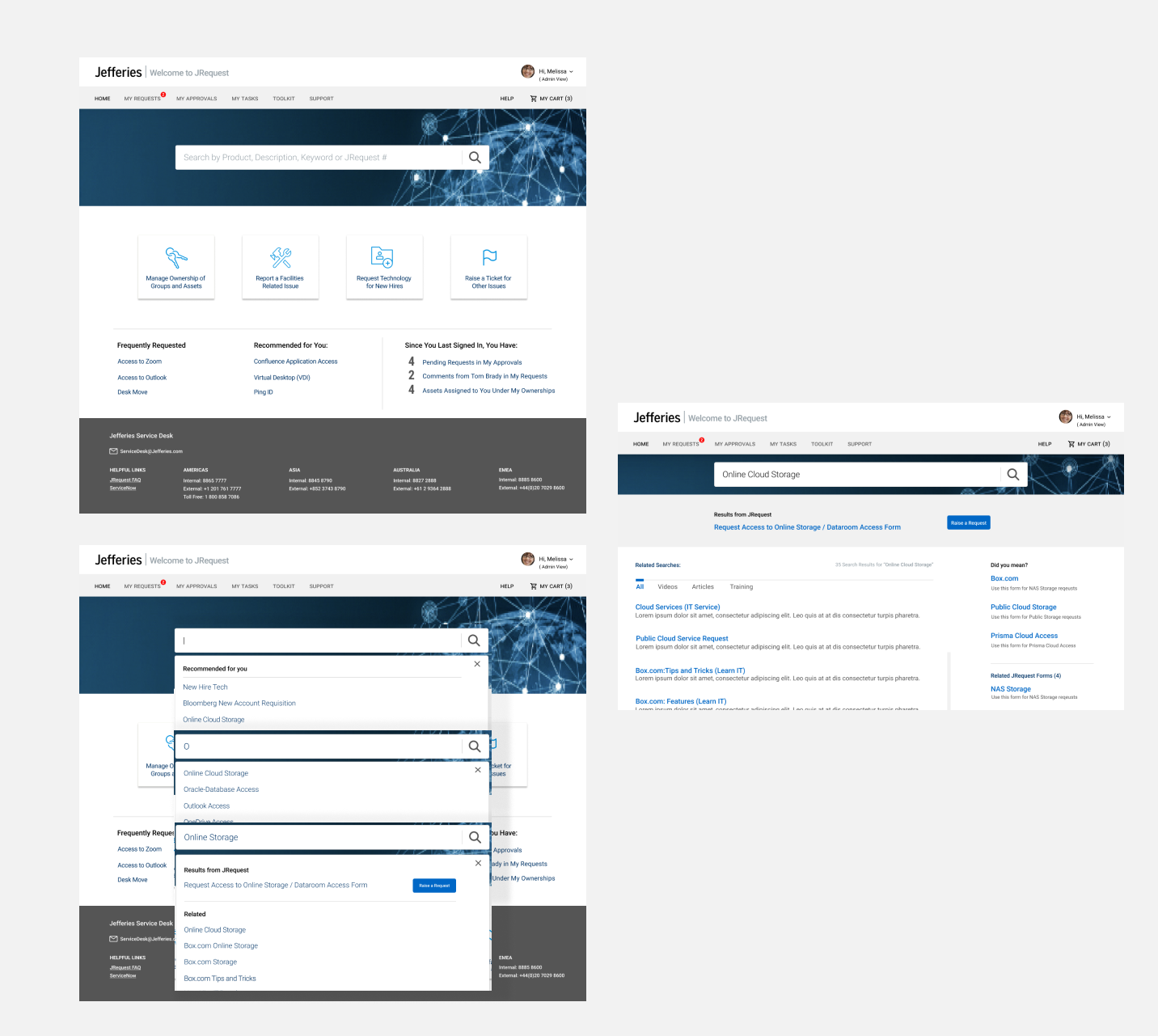
Since the platform would be getting a new search engine, we wanted to emphasize the platform's function to search, which was the site's primary purpose. We wanted to ensure the search bar is the most prominent feature on the landing page. We added functions like recommendation search and search suggestion in the search bar as well as the lower end of the page, so users can quickly locate what they need.

Approval Process:
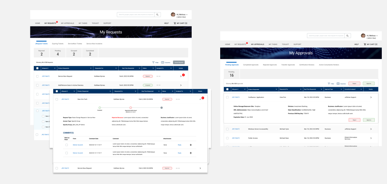
We standardized the look and feel of all the tables throughout the platform. With added functionalities, we ensure the processes for both requesters and approvers are transparent enough so that everyone can understand where they are and what tasks they need to perform at a glance.

Providing Enough Contrast:
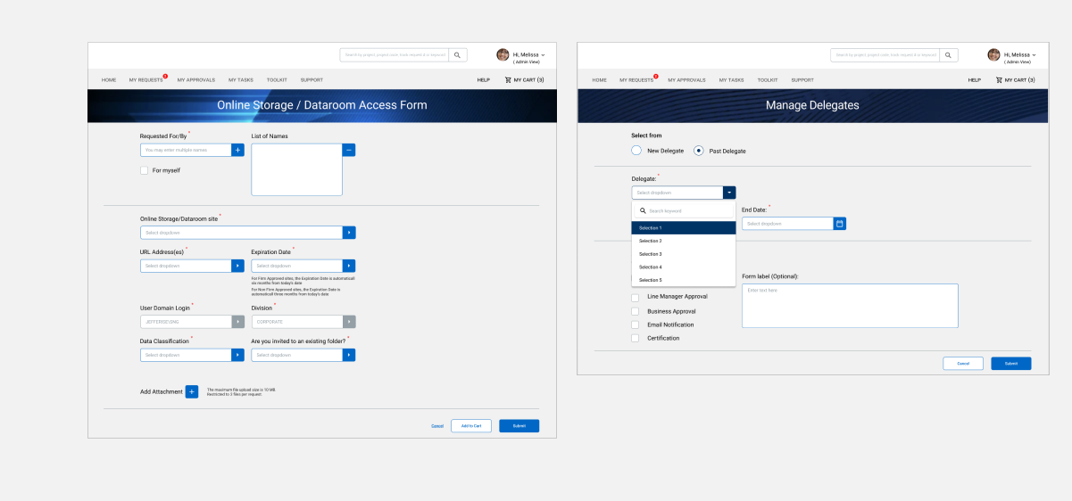
In the original forms, most texts that appeared on top of a colored background did not provide enough contrast and therefore did not pass the WCAG test. In the new design, we wanted to ensure that the color contrasts meet at least the minimum WCAG requirements. I wish there would be more time for me to explore other aspects of accessibility design so more people, especially people with disability, can access the platform with no issues.

Email Template:
I designed a series of email templates for the Jefferies team, where I reorganized the hierarchy and listed the information in order of importance. With this layout, both the requesters and approver can quickly glance at the email and still find the relevant information that matters to them. I also emphasize the importance of action at the top of the email so the viewer knows whether they need to do anything with it.
