
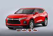

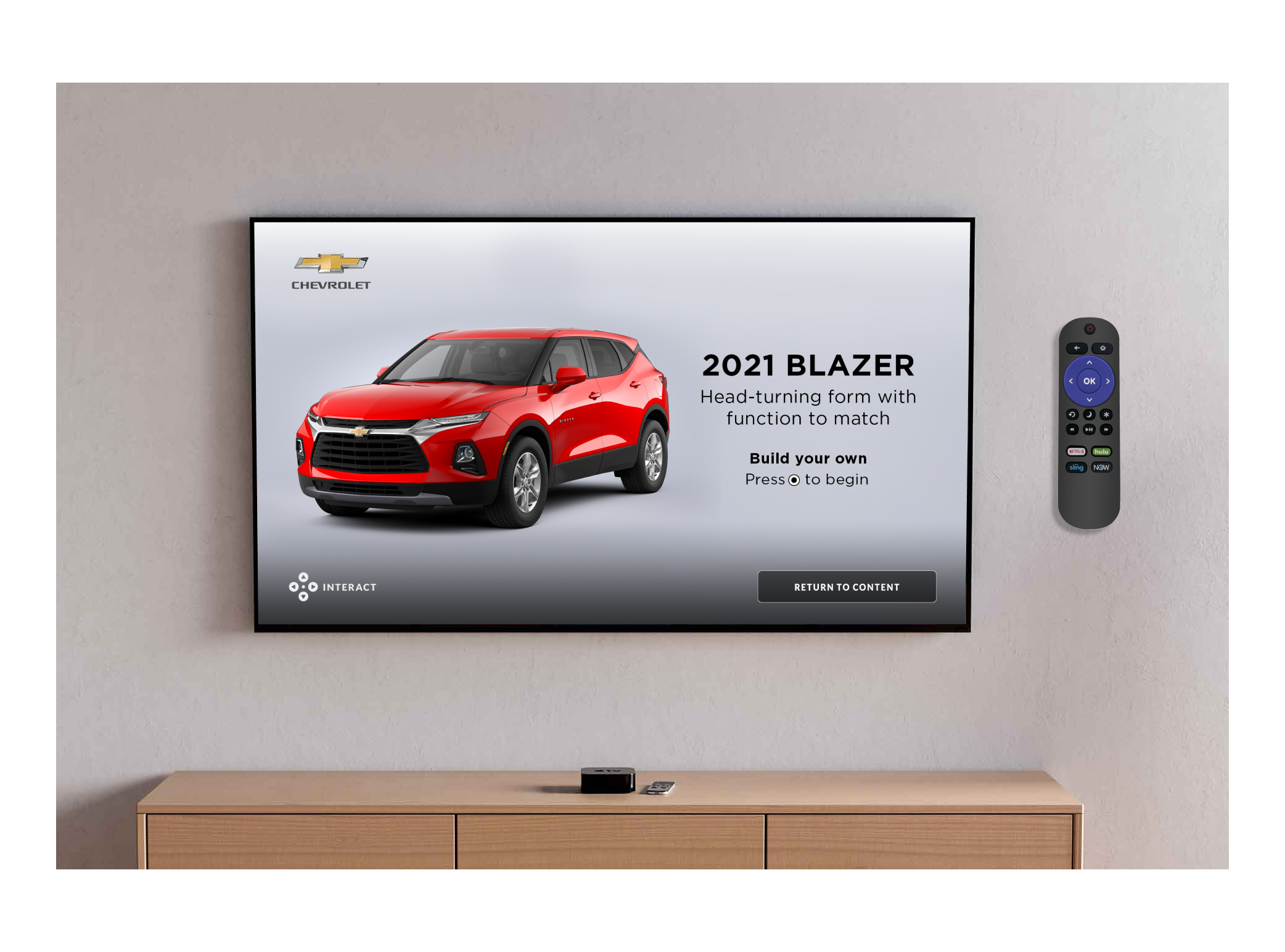
Chevrolet
True X is an innovative ad tech company. Our ad products are so unique that we're constantly looking for opportunities to pitch our creativity and technological capabilities. Our interactive advertisements run not only on desktop and mobile but also on numerous tv platforms such as Roku, Hulu, and Apple TV. This project is a collaboration between the design, strategy, tech, and sales teams to showcase our capabilities on the connected TV platforms for the major automobile brands.

The request
The sales team approached the ad studio team to request a fully developed CTV interactive engagement so that the account executives can pitch to different automobile brands in the upcoming quarters.
The problem
There were three challenges to this request. First, what should the content be for this request? As this unit will be pitched to numerous automobile brands, the contents we picked should be universal to all those brands. More importantly, those automobile brands must also be interested in the content.
Second, The UX design must be intuitive enough, so users know how to interact with our unit using their remote control with minimal guidance.
Third, I need to design an user interface that I can quickly regenerate for a different automobile brand once it sells through but still maintains that brand's true identity.
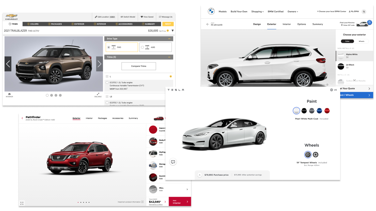

We lacked the budget to conduct primary research to see what consumers wish to see in an automobile ad. We relied heavily on big automobile brands to give us the answer as they would have collected a lot of data from user research. After some research and meetings with the strategy and tech team, we decided to go with the Build & Price functionality as it offered more interactions and options for us to work with. It is also the major selling point on all automobile brands' websites, which from the business standpoint they would be interested in our unit.

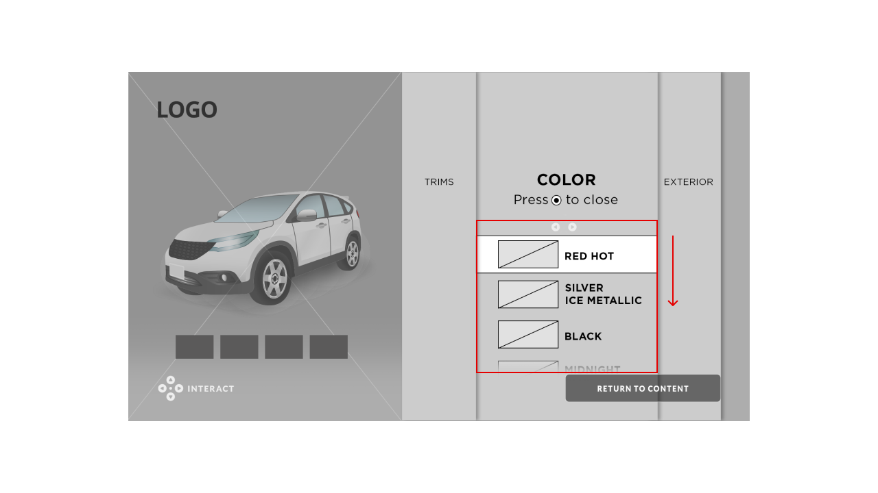

This is my first version of the wireframe. I took inspiration from the Roku user interface. Their navigation systems are designed in rows, and users select their options within one navigation tab by moving down using the remote. However, I realized this iteration might not work; the viewers may have to press the down arrow many times in the Color tab before they can get to the "Return to Content" prompt. It's not a good experience if viewers are eager to get back to their shows and have to press the down arrow numerous times.
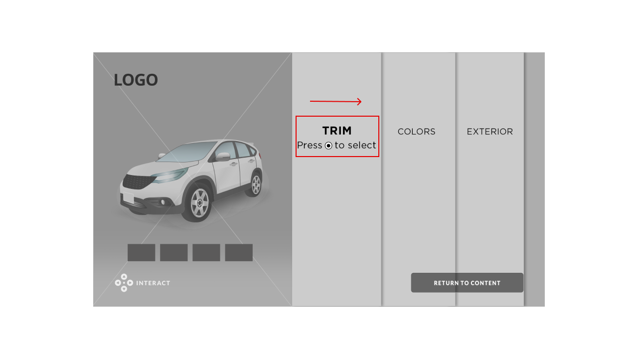
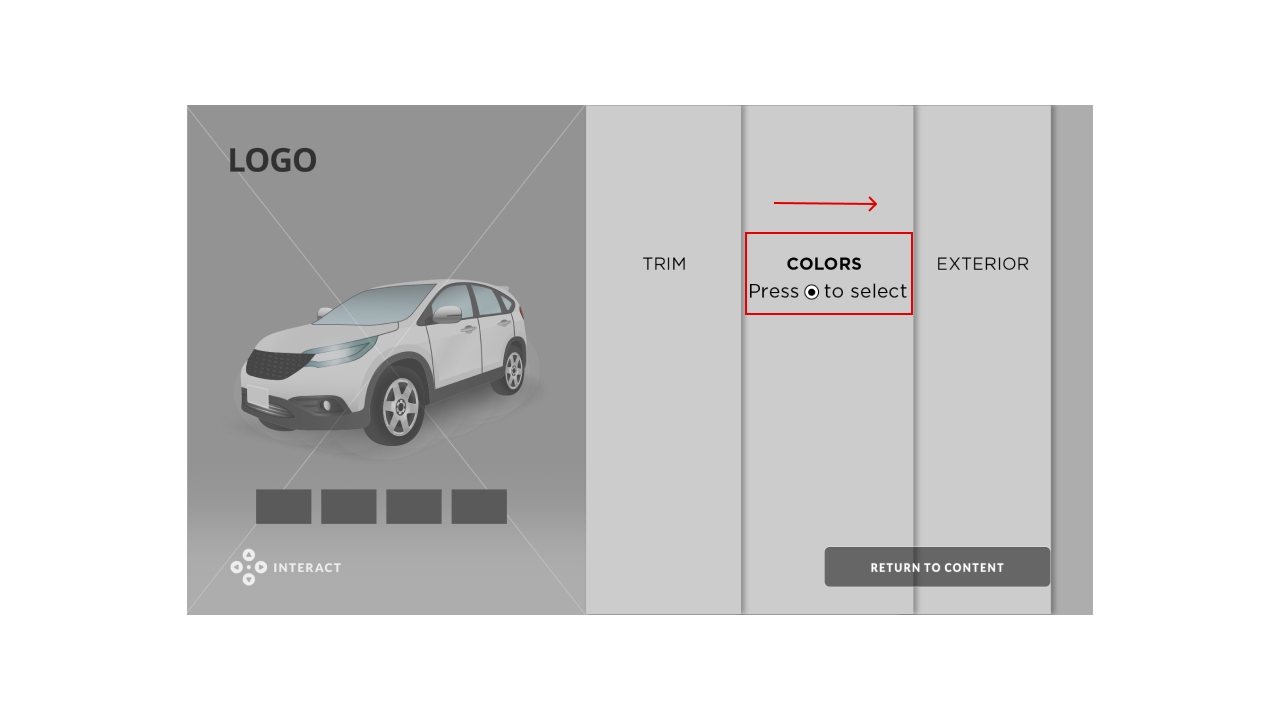
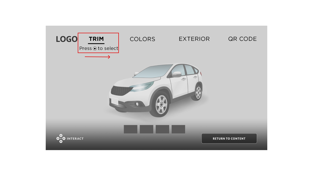
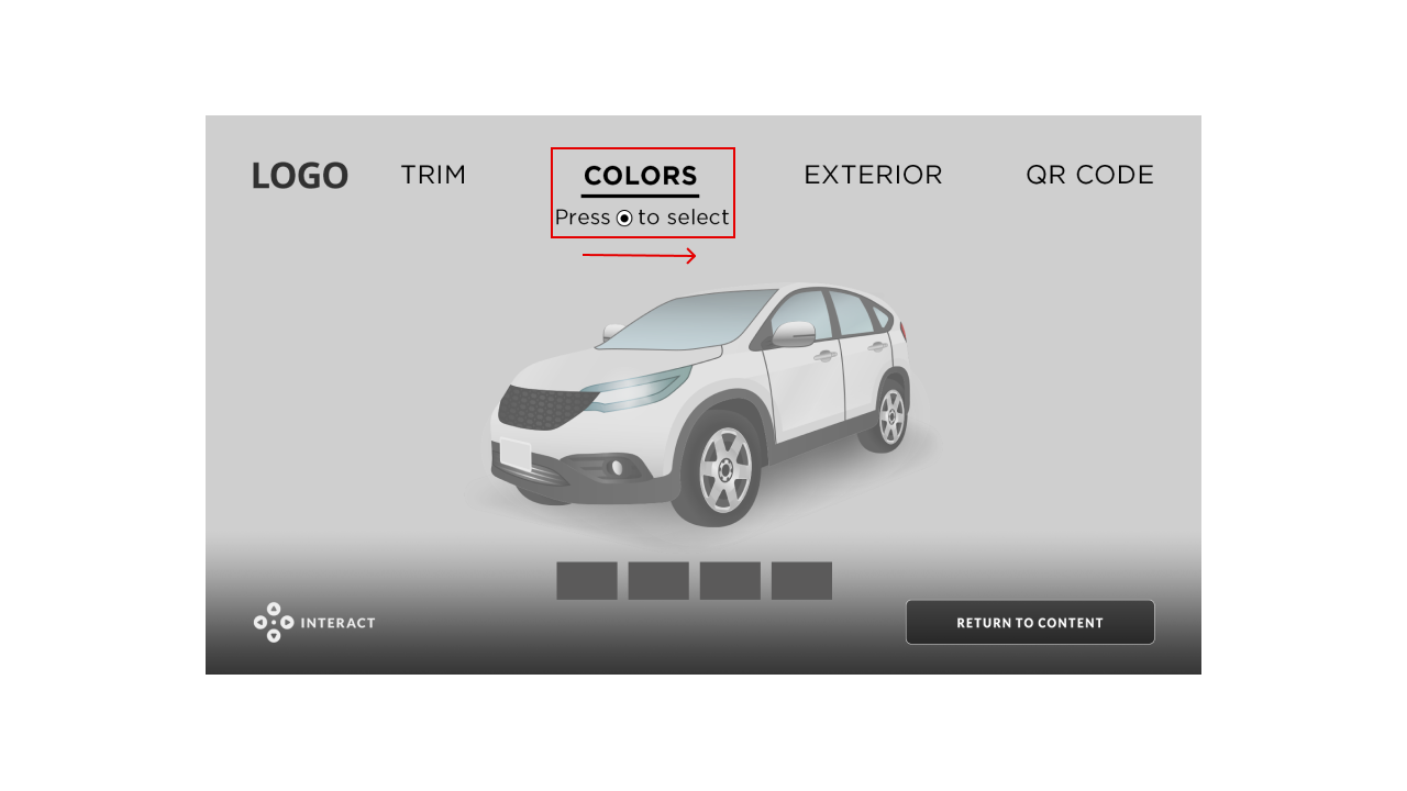
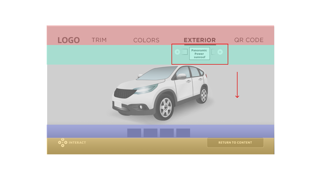
For my second iteration, I quickly abandoned the vertical interactive design as the main navigation because we couldn't solve the "Return to Content" prompt issue, which was more complicated than expected. After that realization, I decided to move all the navigation elements to align horizontally. I also set the vertical selections to only three levels so viewers can get to the "Return to Content" CTA much quicker.
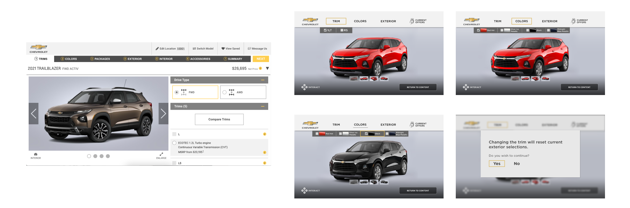

User Interface
After I finished the wireframes and interaction design of the campaign, I quickly jumped to the UI design. I carefully examined numerous automobile brands; I noticed that their websites are quite minimalistic in design; the usage of logos, colors, typography, and layouts is what set them apart. Therefore, even though I'm limited to change-up the layout of the CTV design, I'm confident that by replacing the logo, colors, typography, and UI elements that are unique to the brand, I will be able to replicate the look and feel of the specific automobile brand.
By maintaining the same user flow and layout, we can reuse the code and reduce the production and development time by 4-6 days.